


User Experience (UX) : Game and Level Design Techniques
While developing Story Chaser, Publisto's own in-house speed reading game platform for iOS and Android, our design team faced a huge challenge: we had to fit a lot of content including 6 classic storybooks, 30 gameplay levels, over 60 level objectives and more than 100 hidden animations, in a small-sized screen. Additionaly, it was necessary to create a user interface (UI) that would be clean enough to allow children to develop their kinetic (hand-eye coordination) and mental (speed reading) skills.
After many meetings, mockup scenarios and A/B testing, our design team created a list of guidelines and high-end digital tools for our UI and development team to adopt in order to produce a flawless user experience that would maximize user engagement.
In the design and development process of an application (mobile, web, game) there are some misconceptions that are usually the result of the most common mistake every developer makes. You or your team are NOT your target user. Your first task when you design software is to identify your target user, the user that is going to use the application on a daily basis. This user might not be experienced with large scale systems that have extended functionalities and complexities. You have to make the interface as simple as your target user needs it to be.
The second misconception derives from a mistake that every developer, who has already understood the first misconception, makes. Do NOT underestimate your user. For example, in game design and development a common mistake is to “explain everything”. However, research shows that especially when kids are involved the users are happier with trial-and-error concepts.
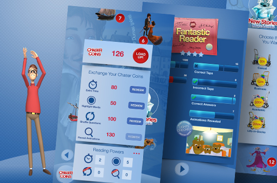
You should always try to balance between the two most common mistakes we just explained. Your design should be easy to understand, but not too obvious. Users should easily navigate through the application and familiarize themselves with the interface and its functionalities. In Story Chaser, in order to achieve this balance we introduced in our game hints, reading powers, an in-game pause screen, animated prizes, bells and whistles.
We also narrowed down our design framework to some rules that we always follow while developing an application (web, mobile) to enhance the user experience and maximize the engagement. The most important are:
• Give good feedback on user interactions
Always notify the user whether the button is active or inactive or whether the form she just submitted was processed successfully or not
• Limit the steps required to take an action
For example, in e-commerce applications, to maximize user engagement, one should always be able to checkout in 3 steps or less (View Product -> Add to Cart -> Checkout).
• Permit easy reversal of actions
It should always be possible for users to review their actions or edit submitted data. This builds a sentiment of trust between the application and the user.
• Don’t strain the user’s short-term memory
The user interface should always be clean and contain the right amount of information. Users have a limited amount of time to make a decision and interact with your application so you should only provide the information needed to help the user’s decision.
All in all, ego is your first enemy when designing a user interface. Ego gets in your way, when it suggests you are your target user. Even if you manage to avoid this trap ego gets a second chance: it tells you that the end user is an idiot. Get around these two traps and you are in the right path to recognize and face the coming “true” challenges of a successful user interface, in game design, in level design and in everything else that needs a user in life…
After many meetings, mockup scenarios and A/B testing, our design team created a list of guidelines and high-end digital tools for our UI and development team to adopt in order to produce a flawless user experience that would maximize user engagement.
In the design and development process of an application (mobile, web, game) there are some misconceptions that are usually the result of the most common mistake every developer makes. You or your team are NOT your target user. Your first task when you design software is to identify your target user, the user that is going to use the application on a daily basis. This user might not be experienced with large scale systems that have extended functionalities and complexities. You have to make the interface as simple as your target user needs it to be.
The second misconception derives from a mistake that every developer, who has already understood the first misconception, makes. Do NOT underestimate your user. For example, in game design and development a common mistake is to “explain everything”. However, research shows that especially when kids are involved the users are happier with trial-and-error concepts.
You should always try to balance between the two most common mistakes we just explained. Your design should be easy to understand, but not too obvious. Users should easily navigate through the application and familiarize themselves with the interface and its functionalities. In Story Chaser, in order to achieve this balance we introduced in our game hints, reading powers, an in-game pause screen, animated prizes, bells and whistles.
We also narrowed down our design framework to some rules that we always follow while developing an application (web, mobile) to enhance the user experience and maximize the engagement. The most important are:
• Give good feedback on user interactions
Always notify the user whether the button is active or inactive or whether the form she just submitted was processed successfully or not
• Limit the steps required to take an action
For example, in e-commerce applications, to maximize user engagement, one should always be able to checkout in 3 steps or less (View Product -> Add to Cart -> Checkout).
• Permit easy reversal of actions
It should always be possible for users to review their actions or edit submitted data. This builds a sentiment of trust between the application and the user.
• Don’t strain the user’s short-term memory
The user interface should always be clean and contain the right amount of information. Users have a limited amount of time to make a decision and interact with your application so you should only provide the information needed to help the user’s decision.
All in all, ego is your first enemy when designing a user interface. Ego gets in your way, when it suggests you are your target user. Even if you manage to avoid this trap ego gets a second chance: it tells you that the end user is an idiot. Get around these two traps and you are in the right path to recognize and face the coming “true” challenges of a successful user interface, in game design, in level design and in everything else that needs a user in life…